Global Best Practices
From Data to Decisions: Elevating Internal Audit With Visualization and Storytelling
Explore how internal audit teams are transforming traditional reporting by leveraging data visualization, analytics, and storytelling techniques. As organizations face increasing volumes of complex data, auditors are adopting dashboards, visual summaries, and interactive reporting tools to communicate insights more effectively. These approaches help move beyond static, text-heavy reports to more dynamic, evidence-based narratives that clearly highlight risks, trends, and opportunities.

Every day, internal audit shares critical information and insights with leaders of various functions, senior executives, and boards of directors. But at a time when organizations are flooded with data, how can internal auditors be certain their messages are successfully conveyed and harnessed for effective decision making?
One solution is to use advanced technologies to enable more robust ways of sharing information. “I am seeing more internal audit teams using data analytics in data storytelling and visualization,” says Tariq Islam, managing director and founder of RapidLynx Consulting, an Australia-based data analytics and AI consultancy specializing in internal audit, risk, and compliance. “Good data storytelling or visualization can really strengthen your impact and back up your findings and insights with data-based evidence,” says Islam, the author of the IIA-Australia whitepaper, Data Visualisation in Internal Audit. “One dashboard can convey a lot of insights in addition to what’s presented in traditional reports.”

Tariq Islam
More advanced teams are already using these technologies as part of their audit reports and for other data-driven initiatives, such as continuous monitoring and audit dashboards. Instead of delivering a report that is thick with tables, internal auditors are using data storytelling and visualization in the executive summary, for example, or through appendices in the report that provide an overview of the data analytics performed and insightful visuals. “You can build in those visuals at various stages of the audit report,” Islam explains.
Dashboards Deliver the Audit Headline
While traditional audit reports are critical for documenting methodology, criteria, and evidence, “used well, dashboards are effective at telling the headline story,” says Zerhow Chan, senior manager, EY Business Consulting, in Houston. He notes that they can reduce time spent interpreting data and enhance shared understanding.
Chan typically uses dashboards and data storytelling when patterns are difficult to see in table-based reporting in some populations, such as transactional data, record logs, and operational metrics. In these cases, “the goal of storytelling isn’t to show all the data, but rather to make the audit question and decision obvious,” he says. These tools can help quickly answer questions such as: What is changing? Where is it concentrated? What looks unusual? What should we do next?
In one engagement, Chan built repeatable analytics to identify exception patterns in a high-volume payment process. Shown in a dashboard, the results allowed business leaders to start at the headline and then drill into the exceptions. The narrative was intentionally simple, showing:
- Trends over time.
- Concentration by segment.
- A list of unusual signals that warranted investigation.
Data Literacy Is Key

Louiza Zenieri
Foundational data literacy is key to unlocking increased use of data analytics, data storytelling, and visualization. “This is probably an area where a lot of internal audit teams need to spend more time,” Islam says.
Louiza Zenieri, manager of information systems audit and data analytics at the Bank of Cyprus in Nicosia, started at the beginning in making the audit team’s shift to data analytics and data storytelling. “To get a better contribution from everyone, you need to have basic knowledge, speak the same language, and communicate on the same wavelength,” she says. The first training session covered definitions of key terms and how various tools are being used across their heavily regulated organization.
Zerhow Chan, senior manager, EY Business Consulting, in Houston, advocates the same approach. “The most important data literacy work isn’t the visuals, it is aligning on definitions and thresholds,” he says. That includes establishing what each metric means, what “normal” looks like in any one report or application, and what should drive follow-up. “When definitions aren’t aligned, the same dashboard can lead stakeholders to entirely different conclusions,” he says.
Zenieri brought in experienced and technical auditors from her team to provide hands-on training to business auditors on topics such as creating dashboards using Microsoft Power BI. She also crafted digital personas that established the expectations for every job position across the internal audit function in terms of expertise in data governance, data engineering, data warehouses, machine learning, AI, information security, information technology, and project management.

Zerhow Chan
“We believe that these are basic skills that every business auditor should have,” she says. She also recruited digital champions from other internal audit teams, people with a high potential to enhance their data literacy who can communicate with others about the value of using the different technologies, as well as offer tips and field questions.
The education effort is ongoing. Zenieri does not see training as a one-time project, because new questions may arise as the team’s use of new tools deepens and expands or as new technologies become available.
Analytics Across the Full Audit Lifecycle
According to Chan, “when applied thoughtfully, analytics and visualization can support planning, risk assessment, fieldwork, and ongoing communication with governance.” For example:
- Audit teams can use visualizations in planning and scoping to quickly identify risk and focus their efforts accordingly. Those visualizations can include:
- Scoping views that illustrate trends in transaction volumes, exceptions, or prior issues by process or business unit.
- Trend views that highlight changes over time.
- Risk-focused dashboards that tell leaders why scope decisions were made and align priorities earlier in the audit lifecycle.
- Fieldwork and testing. Analytics make it possible to shift from isolated sample testing to population level insight.
- In reporting and follow-up, dashboards built for use by executives can translate detailed audit results into clear themes and priority actions.
“Visuals can show issue concentration, severity, and root cause patterns in a way that is easy for leadership to absorb,” Chan says. It’s also possible to show progress on corrective actions using follow‑up dashboards that track remediation status, issue aging, and progress trends across owners or business units.
“Taken together, dashboards and storytelling help audits move from static reporting to insight‑driven engagement across every phase of the audit,” Chan says.
The Right Data for the Right Audience
The reliability of the information used is also key. Internal auditors must determine if the data being presented is robust, well-governed, and of good quality, according to Islam. “Otherwise, the insights that you provide are potentially going to be flawed or incomplete,” he says.
Data quality problems can occur because of weaknesses in the data control environment, including:
- Weak input data controls.
- Data duplications or omissions.
- Outdated information.
- Data inconsistencies.
- Corruption of data being moved from one system to another.
- Data silos that prevent sharing important information with others in the organization.
Poor data, along with weak definitions or oversimplified metrics, are some of the issues to be avoided in building visual presentations, Chan says. “Defensibility is preserved by enabling traceability, so leaders can see definitions, population details, and how conclusions were reached,” he says.
Visualizations can help a range of audiences outside internal audit remain better informed. Given the current extensive level of narrative in audit reports, over the years, board committees and senior management have told Zenieri’s team that they mainly focus on the executive summary. Providing more accessible-looking information can enable them to be more engaged and find information they might not otherwise have seen, she says. Visualizations make it possible to cover an entire population, showing exceptions and trends and providing insights that may not be caught in a large narrative document.
New Guidance on Building Data Analytics Capability
To help internal auditors keep pace in a digital-first environment, The IIA has released a new suite of guidance on data analysis technologies, including two Global Practice Guides — Understanding Data Analytics for Internal Auditors and Data Analytics Skills for Internal Auditors — along with the Audit Analytics Maturity Model tool.
Together, these resources provide a practical framework for strengthening analytics capability, helping audit functions understand key analytics approaches, identify relevant data sources, and address foundational issues such as data quality, governance, and extraction. For organizations looking to advance their use of data visualization, the guidance also reinforces an essential principle: Effective visuals begin with reliable data, strong analytical skills, and a clear understanding of how insights support audit objectives.
Maintaining Focus
Can visualizations highlight risk as effectively as a traditional audit report? They can, if assurance around the risks is explicit, not implied, according to Chan. Rather than letting a red or green indicator in a presentation speak for itself, he recommends that presentations clearly show:
- Exposures: What risks exist and where are they concentrated?
- Coverage: What work has the internal audit team performed?
- Direction: Is risk rising or receding over time?
New technologies can enable more real-time insights. “Internal auditors should be asking how they can develop more continuous monitoring and continuous auditing dashboards to transform the insights they provide,” according to Islam, because they present immediate information on key risks or other areas that might need scrutiny. “There will be exceptions that may have historically been identified through manual testing, but with continuous auditing, you're actually automating the identification of audit exceptions,” he says.
For example, a financial services organization might have hundreds of projects that are run within the organization, which can make it harder to identify high-risk projects. Internal auditors can set up continuous monitoring dashboards, including project key risk indicators, using data feeds from different project management data sources. This allows the identification of issues across the entire project population, such as excessive delays in project execution dates and unusual changes to budgets, or in resourcing and identification of high-risk projects for deep dives, Islam explains. And while dashboards typically summarize data, it is possible to develop ones that allow users to drill down for more detail as needed.
Dashboards may not always deliver all the detail that internal auditors need, Zenieri notes. In a highly regulated environment, for example, meticulous detail is often needed on the type of testing done, and a visual may not do this information justice. On the other hand, a dashboard can show that the internal auditors have tested the entire population, along with exceptions and trends over time, she notes.
Improved Decision Making
Using data analytics in data storytelling and visualizations can provide a variety of benefits. “When visuals are explicitly linked to business risks, conversations shift from reviewing data to deciding what to do next, driving stronger engagement and more decisive outcomes,” Chan says. “The goal isn’t to show work, it’s to move decisions.” Internal auditors should begin to understand and experiment with the available options to determine the advantages they can offer in their own work.
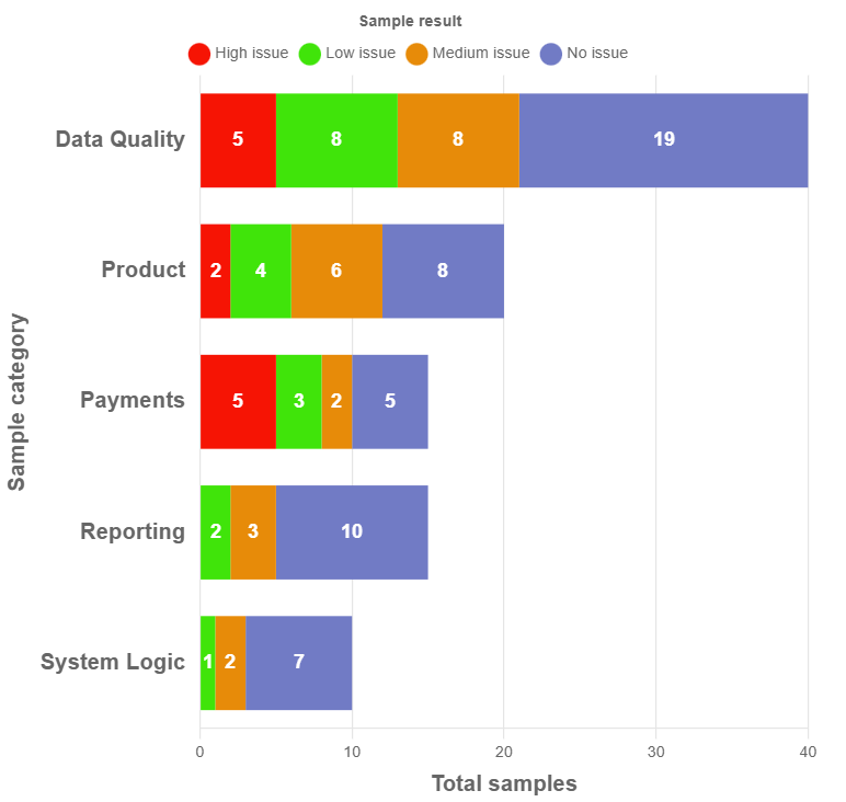
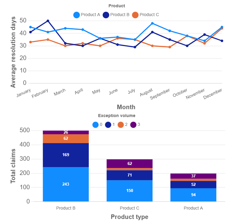
Audit Report Dashboard Visual
The three graphics provide a dashboard visual of audit scope, claims resolution performance, and testing results. The left visual highlights the audit areas reviewed and the volume of samples tested, with color coding identifying areas with material weaknesses. The top-right visual shows claims resolution times across three products over a 12-month period, enabling comparison of performance trends. The bottom-right visual presents audit testing results, showing the volume of audit exceptions by product, with color coding used to indicate the number of exceptions identified per claim.
Source: Tariq Islam
Disclaimer
The IIA publishes this document for informational and educational purposes only. This material is not intended to provide definitive answers to specific individual circumstances and as such is only intended to be used as peer-informed thought leadership. It is not formal IIA Guidance. The IIA recommends seeking independent expert advice relating directly to any specific situation. The IIA accepts no responsibility for anyone placing sole reliance on this material.
Learn more with our other resources
From Policies to Proof: Auditing Ethics & Culture in Regulated Financial Institutions
Skills for the Modern Internal Auditor
May 22, 2026